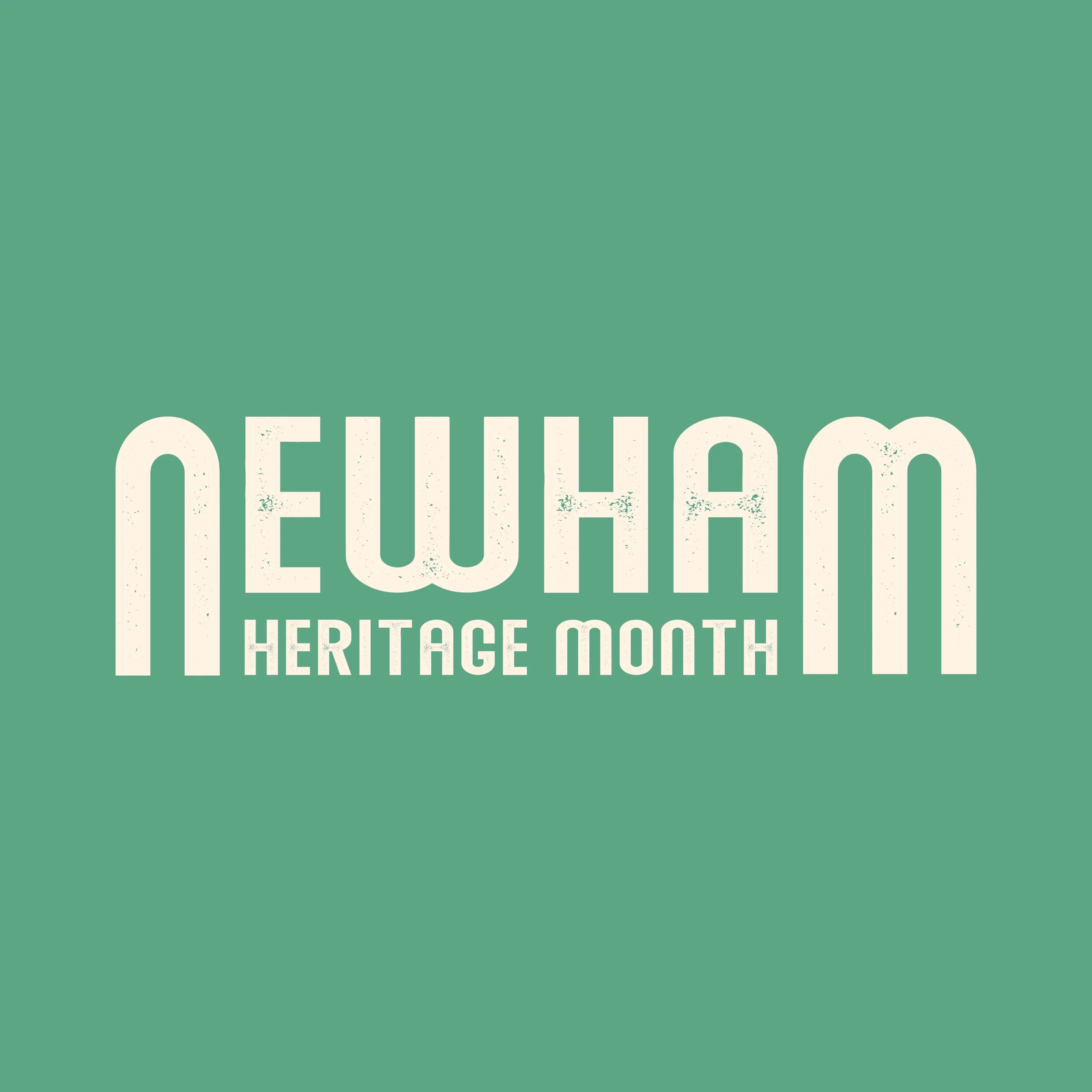
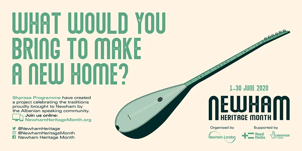
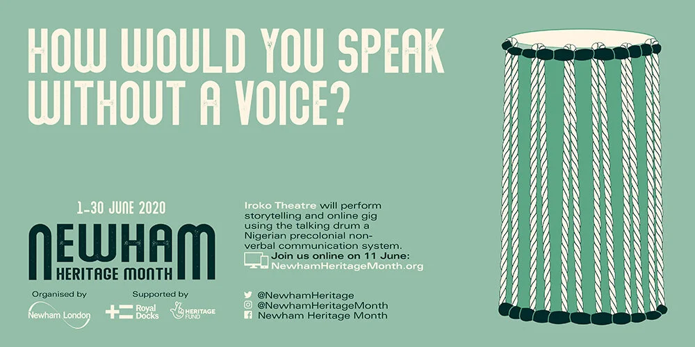
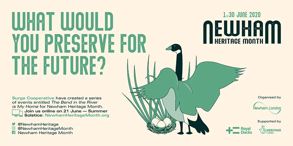
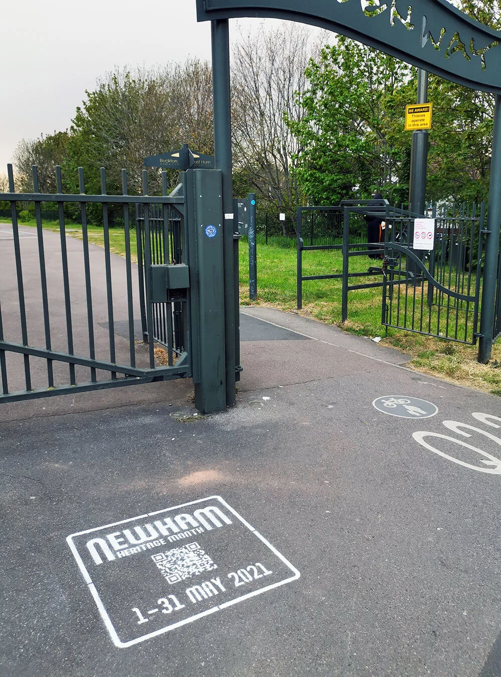
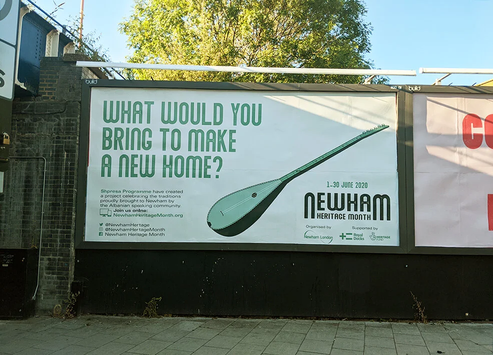
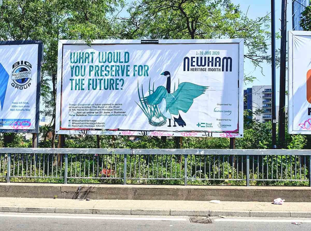
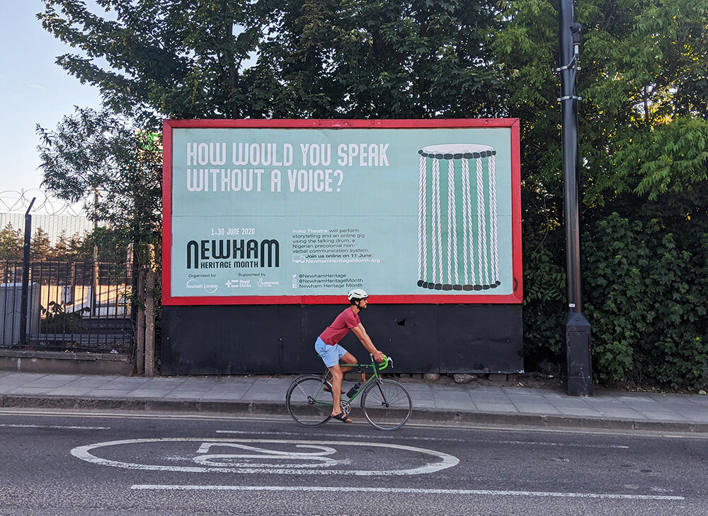
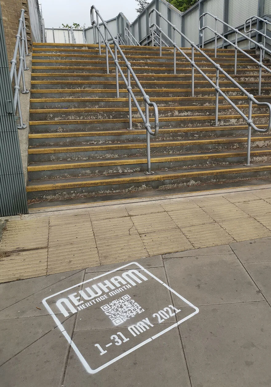
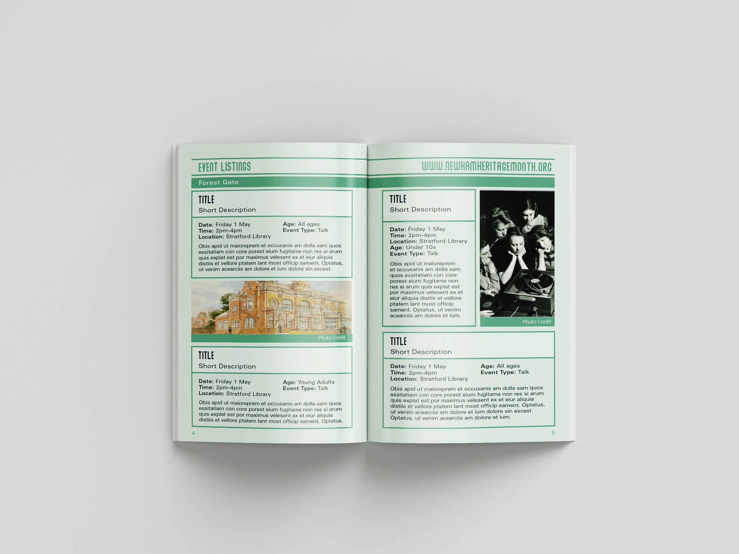
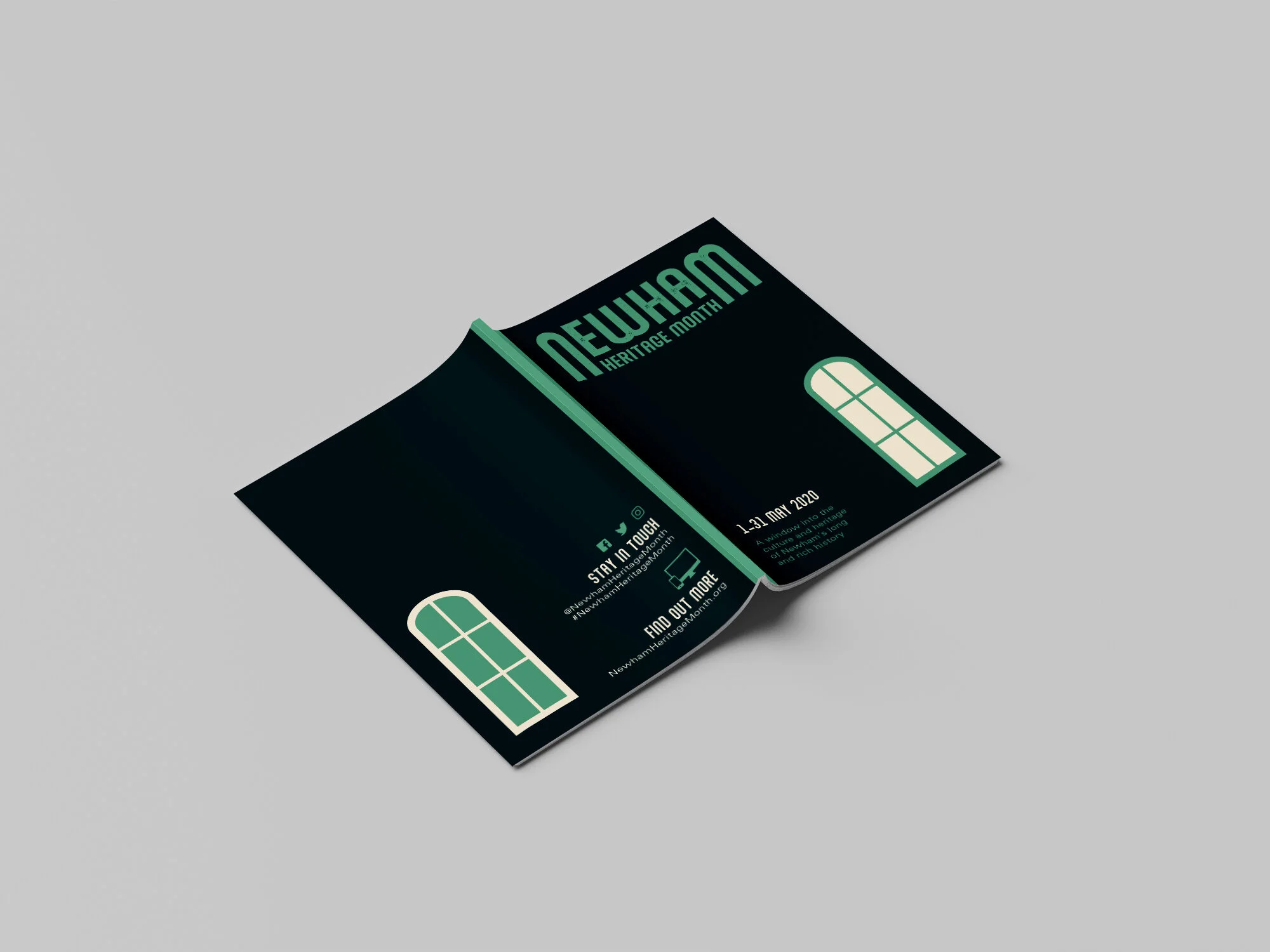
Newham Heritage Month is an annual heritage festival organised by Newham Council, which includes words, voices, photos, youth events and workshops around the borough over the month of June.
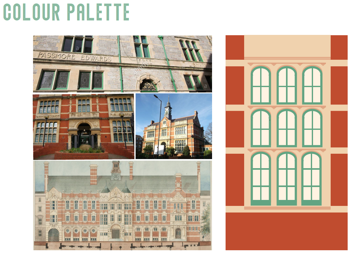
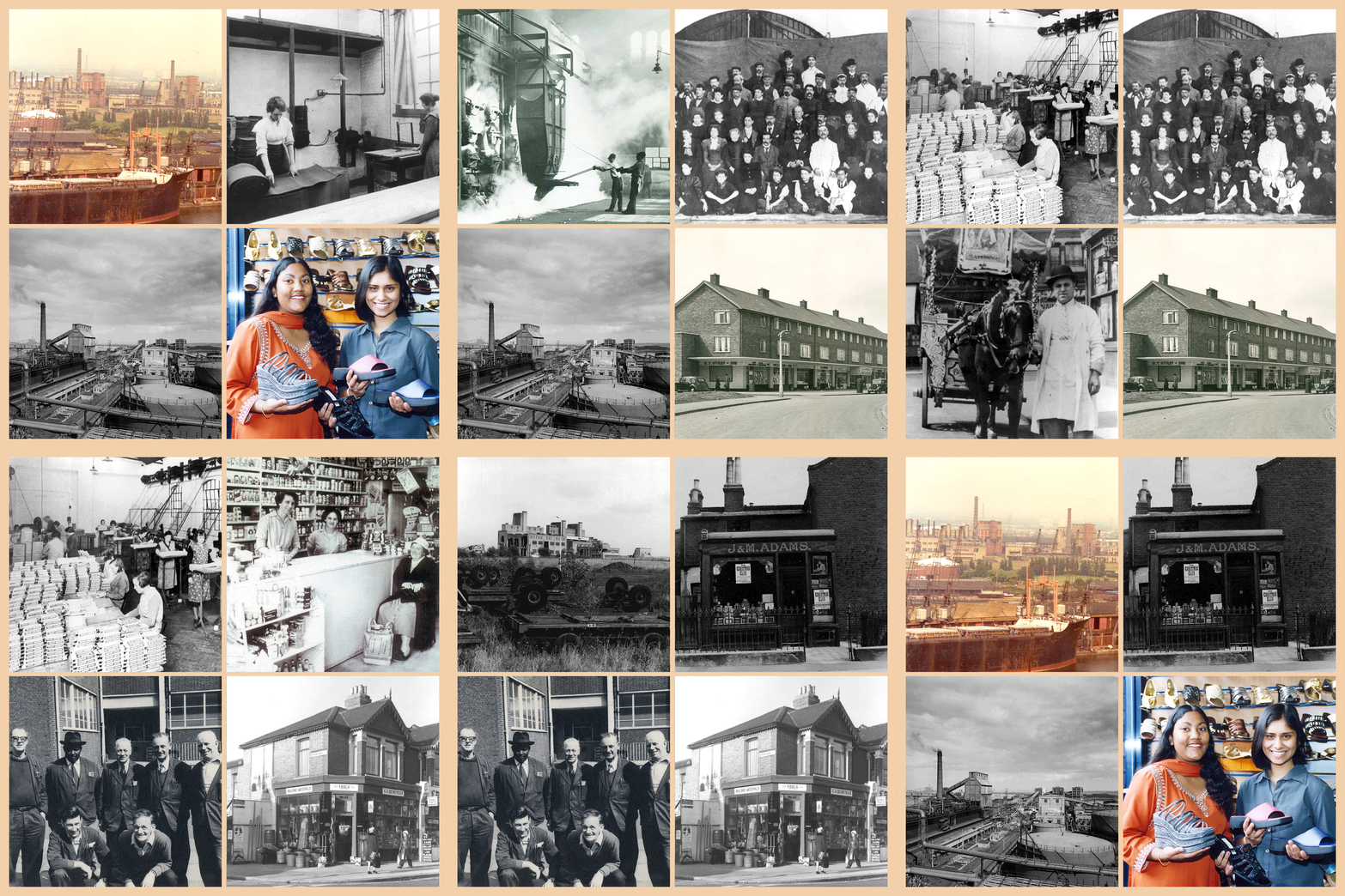
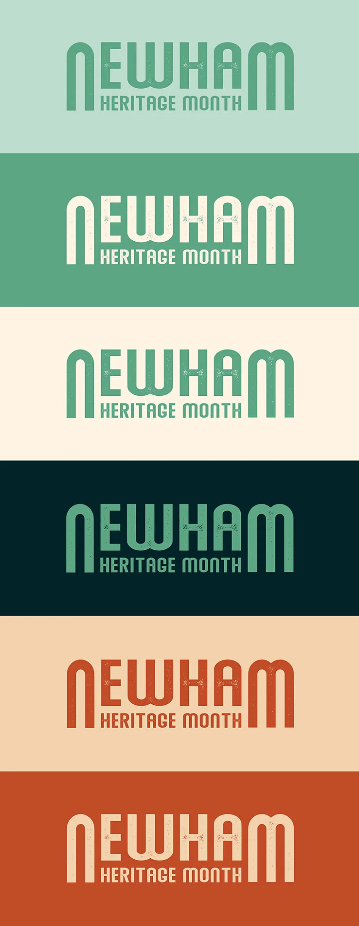
Originally briefed for the 2020 festival, the team wanted a logo and palette to reference the iconic buildings of the area (considering the area is now being heavily regenerated) such as the Tate & Lyle factory and Abbey Mills Pumping Station aka the Sewage Cathederal.
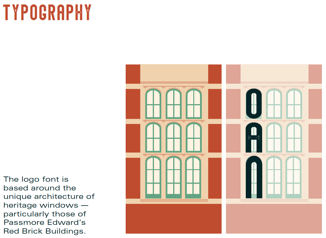
I drew inspiration from the architecture of the borough, the aesthetic of letterpress, 20th century Newham shop fronts and retro advertisements and packaging. The logo font is based around the unique architecture of heritage windows — particularly those of Passmore Edward’s Red Brick Buildings.
KEY WORDS:
RADICAL
DIVERSE
INDUSTRIAL


